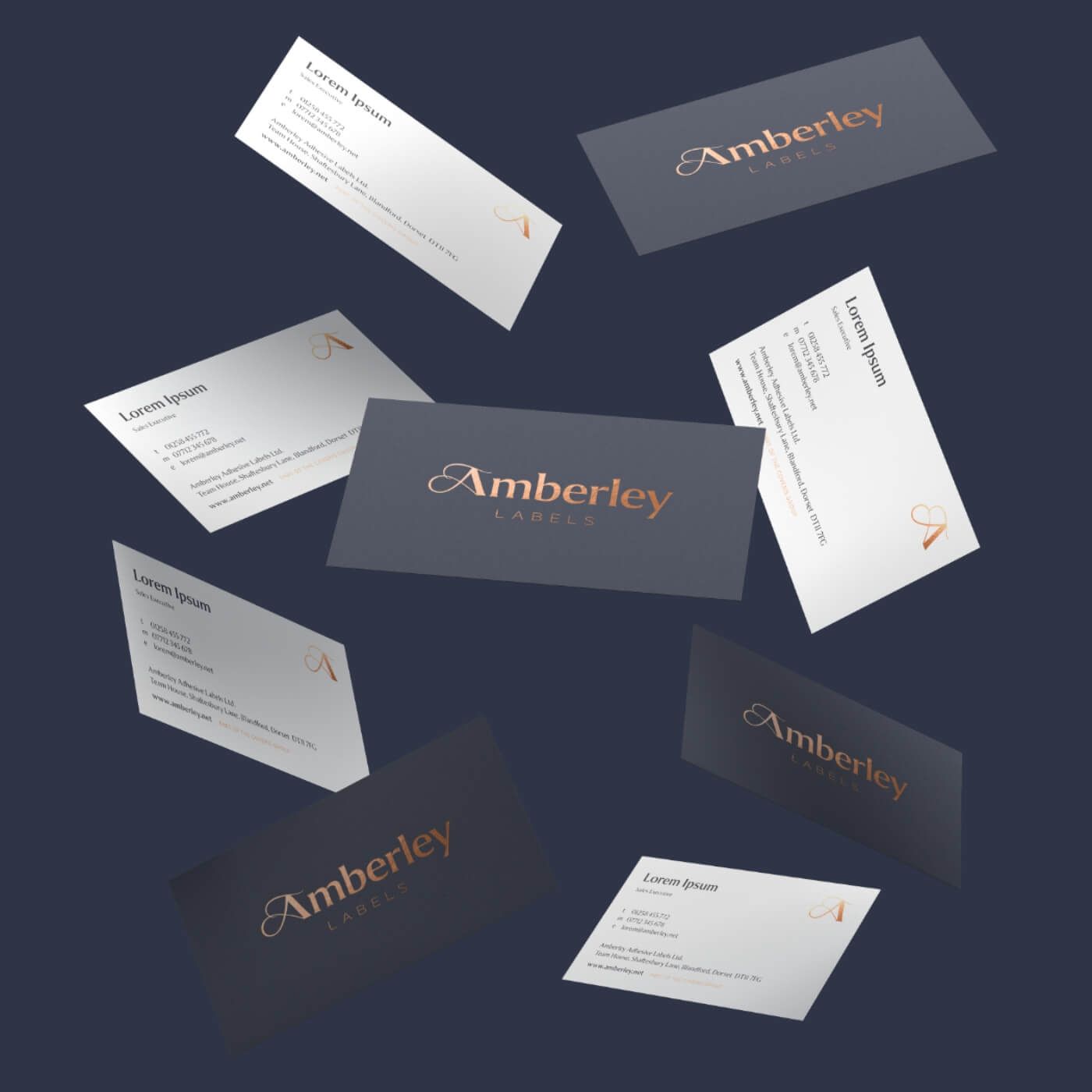
Amberley Labels A luxury new look for Amberley Labels
A premium brand makeover for an award-winning decorative label business.
Amberley needed their brand to exude quality and appeal to design agency creatives and luxury brand owners.
Amberley Labels have a long history going back over sixty years, in which they have become experts in world class, multi-process, print and embellishment technologies.
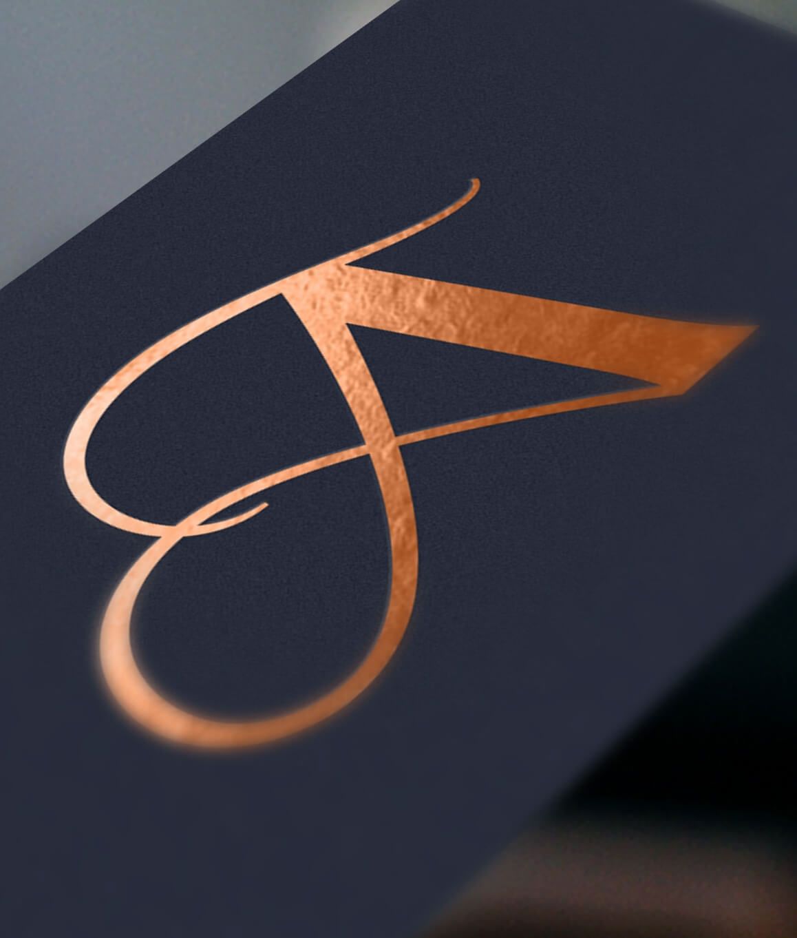
Optima crafted a bespoke brand mark and monogram – confident and refined with a little bit of flourish. Copper foil was chosen as the primary brand material, paired with a blue-grey brand colour to set it off beautifully – and a premium brand was born which does justice to their values and culture of quality. The brand identity evokes the same elegant style as many of the award-winning labels that Amberley produce; which are applied to premium gins and spirits, wines, fragrances and fancy foodstuffs.

The bespoke Amberley ‘A’ has been crafted within the brand mark and is also used as a standalone monogram, to represent a shorthand version of the brand. The typography features the font Collier, inspired by early twentieth century lettering, with elegant but quirky nicks and flares providing a refined character but with plenty of personality.


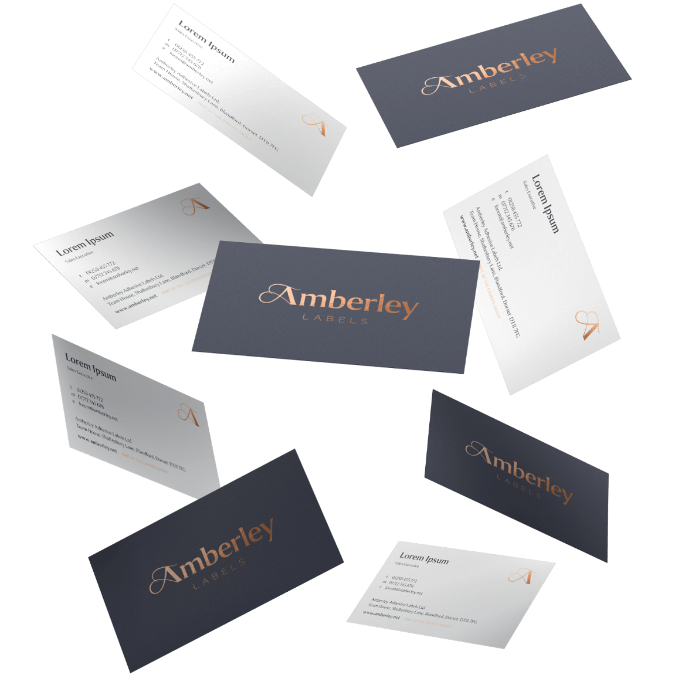
Amberley's luxe new look carries through into every element of the brand presence, including corporate stationery which has been elevated using copper foil blocking and card edging in contrasting grey and crisp white paper stocks.

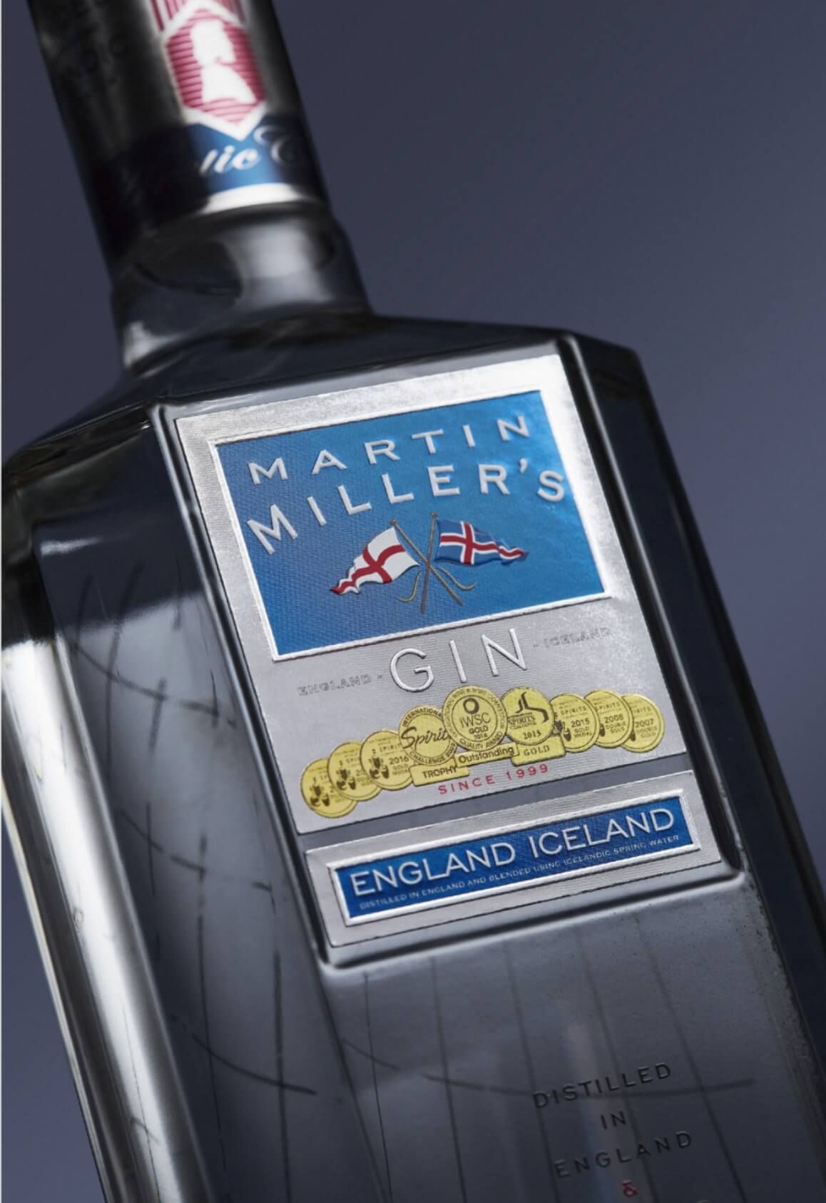

Optima directed the photography brand style for Amberley’s products and their people. The photography, with a superb level of detail, helps to convey their passion for perfection and obsession for quality. The resulting images are showcased beautifully on the company website and create a distinctive brand presence on social media feeds which stops you mid-scroll.

